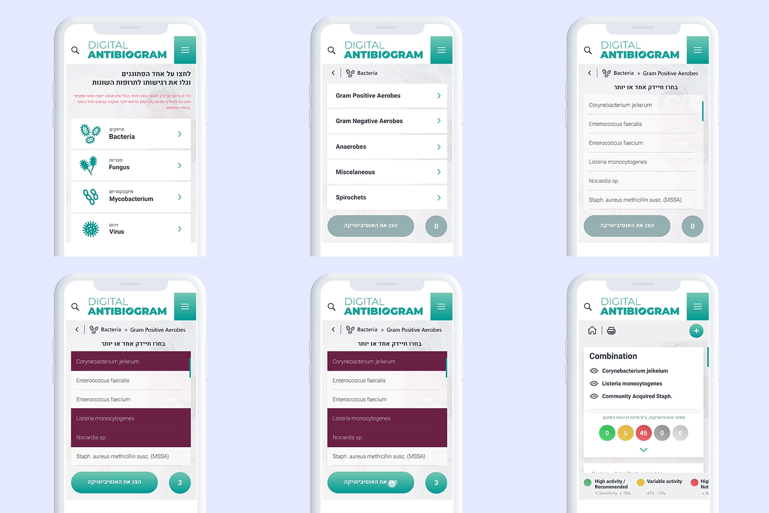
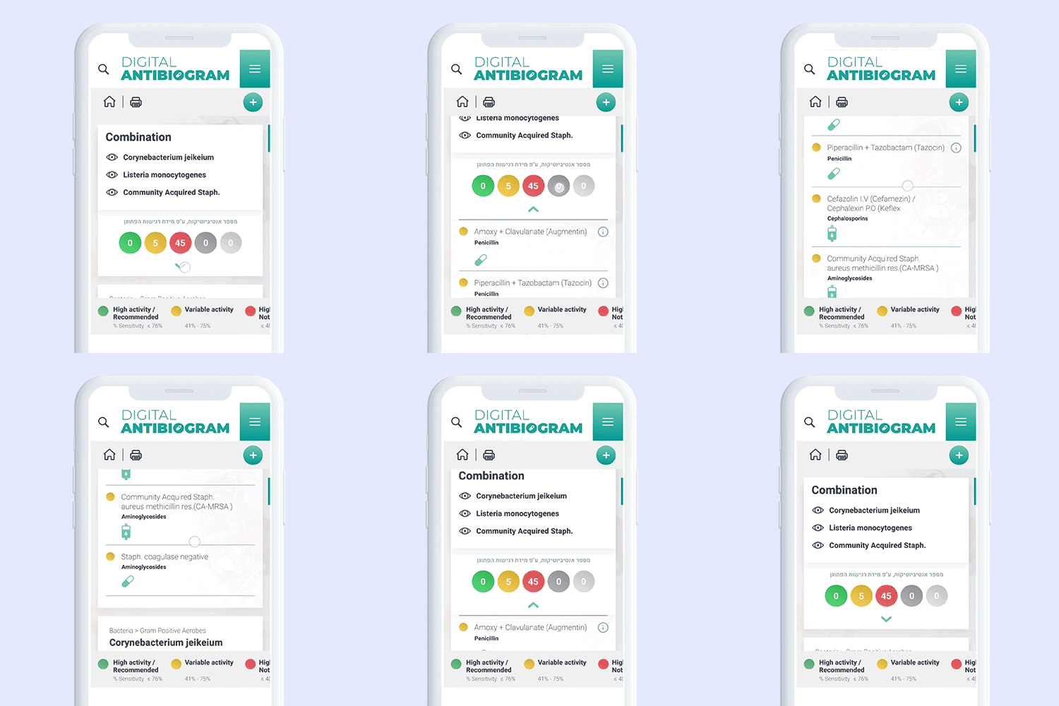
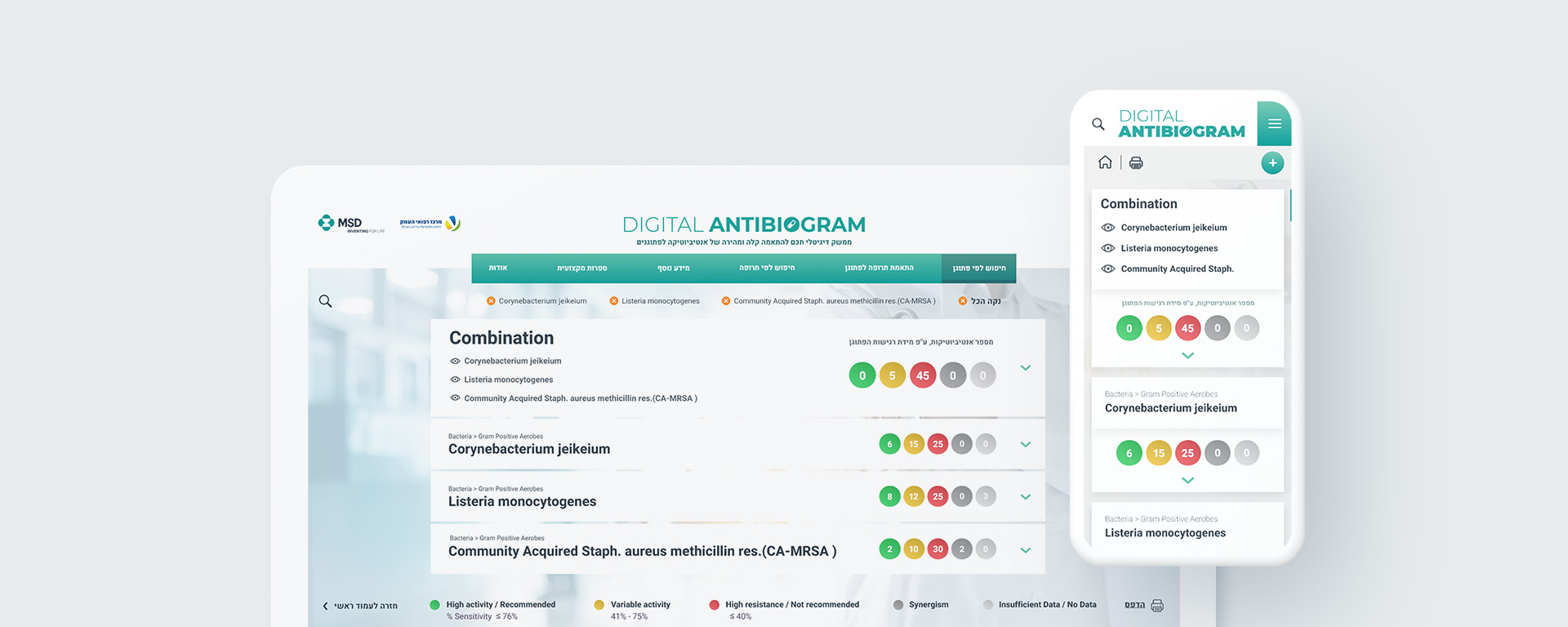
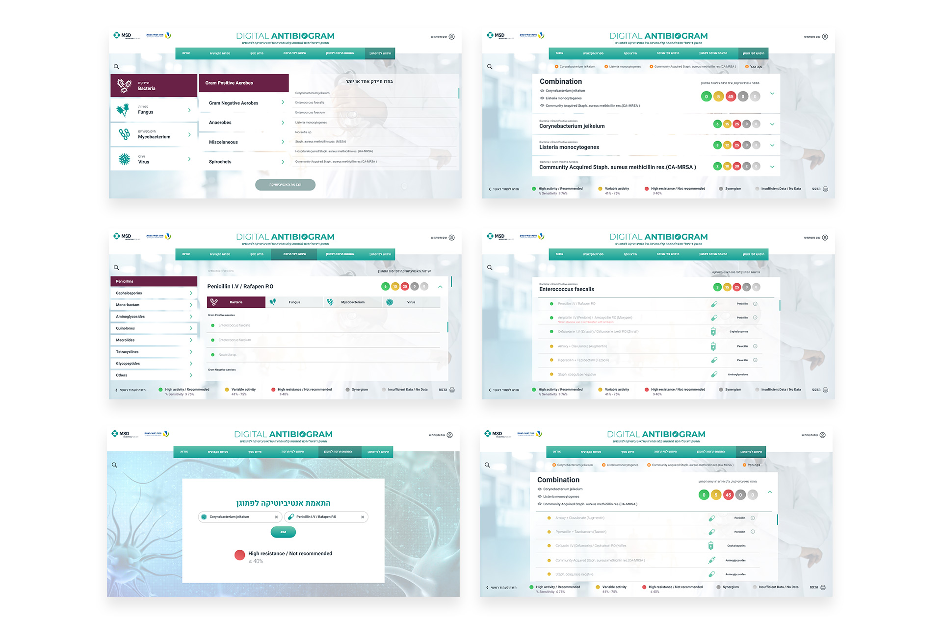
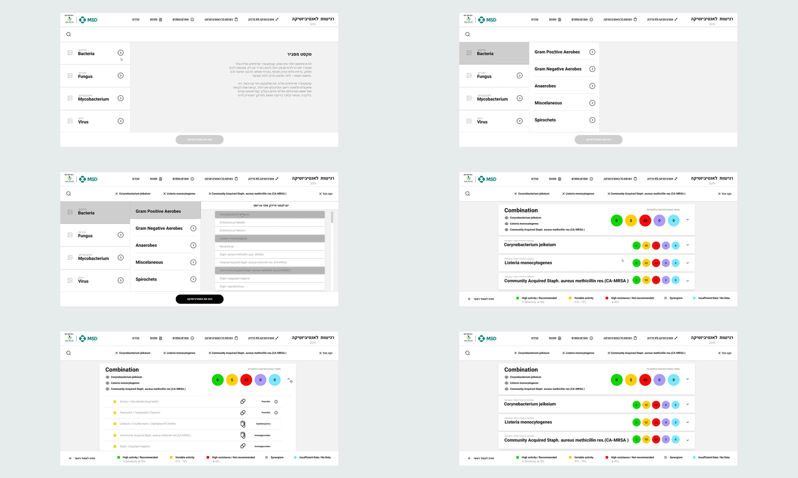
MSD needed to make some updates on their Bacterial resistance table for antibiotics. Doctors use that tool to find out the most appropriate antibiotic to treat their patients. There were two problems: it was a complicated, cumbersome, hard-to-follow table, and it was only accessible in a hard copy. So, we created a new Online version that is much more friendly for doctors to work with.
Digital Antibiogram
We created a Smart digital interface for matching medicines and pathogens

Client

Credits
Chief Creative Director: Sahar Lewenstrein
Chief Art Director: Miriam Moshinsky
Art Director: Yanay Halevy
Project Manager: Ofer Klein
Web Developer: Yehuda Yadid
Tags
WEBSITES
Imagine you're a doctor that needs to choose the right antibiotic for your patient. The main thing you should know is that there is a table called The Bacterial Resistance Table for Antibiotics, and doctors need to follow it when they choose how to treat their patients. Scientifically, that table is brilliant. UI-wise, not so much: it is impossible to work with. We're talking about a gigantic, complicated table with hundreds of tiny squares in different colors that is printed on a small piece of paper so the doctors would be comfortable to fold and put in their pocket. The result is that not only does it's complicated to work with – it's also easy to make a mistake. One mm down with your index finger – and your patient got the wrong medicine.
When MSD told us they’re looking to create a digital day-to-day working tool for medical staff that will establish its position as an innovative brand, trustworthy partner when it comes to antibiotics, our suggestion was to transform that hard copy table into smart digital interface, that will make it easier for doctors to work with and prevent crucial mistakes. The result is so elegant, simple, and easy to use – some doctors are still thanking us to this day.
